Redesigning account planning for agricultural sales teams.
Sales representatives needed to review account details, annual plans, historical sales, forecasts and field information while planning activities across multiple accounts.
The existing experience made it difficult to compare information, identify priorities and prepare account plans efficiently.
I redesigned the account planning experience to improve information hierarchy, support faster decision making and help sales teams manage account data more effectively in the field.
Planning starts long before the visit.
Account planning is a critical activity for sales representatives working with agricultural retailers and growers.
Before planning visits or defining sales opportunities, representatives needed to review information spread across multiple categories.
- 01Account Information→
- 02Classification→
- 03Annual Plans→
- 04Historical Sales→
- 05Forecasts→
- 06Product Performance→
- 07Field Locationscontext
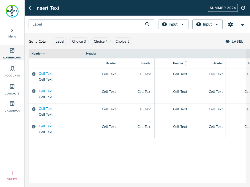
Too much information, not enough clarity.
A single planning view had to carry account context, business performance, product detail, and field logistics — each with its own dimensions.
The challenge was not displaying more data. It was helping sales representatives understand and act on that data quickly while planning their activities.
What reps actually do when they plan.
Representatives think in accounts, not metrics.
Users first wanted to understand the account before analyzing performance numbers.
Product categories matter more than raw numbers.
Representatives naturally grouped information into Seeds and Crop Protection rather than reviewing metrics independently.
Location influences prioritization.
Distance often influenced which accounts would be visited first.
Comparison is a key task.
Representatives regularly compared accounts before deciding where to focus their effort.
Four principles for the redesign.
Create a clear information hierarchy
Help users move from account understanding to performance analysis without losing context.
Reduce cognitive effort
Present related information together rather than distributing it across disconnected columns.
Support account comparison
Allow users to compare accounts without excessive scrolling or navigation.
Incorporate field planning context
Surface location-related information directly within the planning workflow.
Exploring ways to structure performance data.
Column-heavy
Every metric displayed as a separate column. Reps had to scan horizontally and reconstruct relationships in their head.
Grouped by category
Product performance grouped by category within the same information area — preserving hierarchy while making relationships easier to understand.
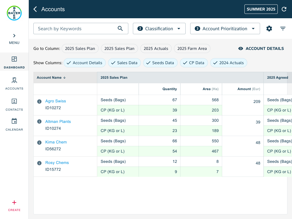
After evaluating alternatives, I explored grouping related product information within the same cell. Instead of creating additional columns, Seeds and Crop Protection information was displayed as stacked sections inside the performance area. This preserved hierarchy while making relationships easier to understand.
One planning surface. Built around how reps think.
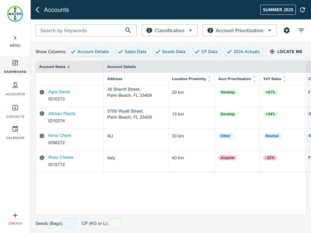
Account summary
Each row begins with key account information, providing immediate context before users review performance data.
Structured performance data
Sales information is grouped by product category, allowing representatives to review Seeds and Crop Protection without navigating multiple columns.
Distance from me
A proximity column highlights the distance between the representative's current location and the field — helping prioritize nearby opportunities.
Scalable information architecture
The structure supports future planning periods and additional business metrics without significantly increasing complexity.
The thinking behind the structure.
Grouping over fragmentation
Related information was grouped together to reduce visual fragmentation and improve scanability.
Progressive disclosure
Information was structured to reveal detail progressively rather than exposing every metric at the same level.
Recognition over recall
Important planning information remained visible within the workflow.
Contextual decision making
Distance information was surfaced directly within the planning experience.
Sales representatives could plan with greater confidence.
✓ Review account information more quickly
✓ Compare accounts with less effort
✓ Understand product performance more easily
✓ Consider proximity while planning visits
✓ Navigate complex planning information with greater confidence
What I learned.
This project reinforced an important lesson about enterprise UX. The challenge was never the volume of information. The challenge was helping users make sense of that information.
By focusing on hierarchy, grouping and planning context, I was able to transform a dense data management screen into a workflow that better supports decision making in the field.
"Good enterprise design isn't about showing more information. It's about helping people understand what matters."